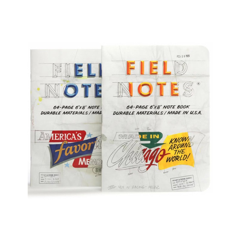
THE CHICAGO LOOK EDITIONThe Chicago Look, Edition which explores a chapter of American design and typographic history through the lens of a single, highly influential and sadly now-defunct enterprise.The Beverly Sign Co. put Chicago at the center of the mi

The Chicago Look, Edition which explores a chapter of American design and typographic history through the lens of a single, highly influential and sadly now-defunct enterprise.
The Beverly Sign Co. put Chicago at the center of the mid-century sign-painting map with its panelized compositions, novel typographic treatments, and bold colors. This style came to be known as The Chicago Look. Watch the film below for lots more about the history and techniques behindthe look.
Chicagos ownHeart & Bone Signs, withcollaboratorBob Behounek, have created two covers in the style of Beverlys pencil sketches, featuring the original mock-upsdistinctive diagonal strike-thru indicating the colors of the signs to the clients and the sign-painters (known as Wall Dogs).
These note books are a new size for us; a handy 6″ 8″ (152.6mm 203.2mm). The 64 pages are graph-ruled inNon-Repro Blue,a particular shade that is still used in the graphic arts industry to be easily removed from photostats or scans of black-and-white artwork.As usual, the inside covers are full ofhistorical information, illustrations, and wise-cracking.


Reviews
There are no reviews yet.